Every New Year arrives with its familiar rituals. We raise a glass, make a resolution, and offer a toast to things we hope will be different this time around: better habits, better balance, better health. We say “I’ll drink to that” as shorthand for optimism, an easy affirmation that the future is still negotiable and a longer life is possible.
Then along comes a map.
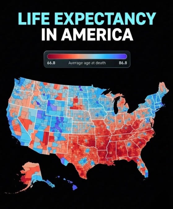
At first glance, it looks political, counties shaded red and blue, borders sharp enough to stir tribal instincts. But this map isn’t about elections or ideology. It’s about how long people live. And once you realize that, it’s hard to unsee. In some parts of the country, the average life expectancy approaches the mid-80s. In others, it barely cracks the mid-60s. A 20-year gap, not between nations, but between neighbors separated by a state line or a 15-minute drive.
That’s not a rounding error. That’s an entire generation, or as I prefer to view it, an extra adulthood.
The map (a close mirror of the CDC small-area life expectancy data) drills down not just to states, but to counties and even census tracts, offering one of the most granular views we’ve ever had of American longevity. What it shows is unsettling precisely because it’s so clean. The patterns are unmistakable. The Southeast bleeds red. Appalachia struggles. Pockets of the Midwest sag. Meanwhile, parts of the Northeast, the West Coast, and a few urban corridors glow blue, promising longer lives.
Naturally, the commentary followed. Social media did what it always does: It argued.
Some saw social determinants of health, full stop. Others insisted the map was really just a proxy for wealth. A few wanted to know whether it reflected life expectancy or merely average age of death. Still others layered on explanations (race, rurality, education, heat exposure, Medicaid expansion, hospital closures, food insecurity, trauma, tornadoes, even politics).
I had my own theory: aging baby boomers from the north were migrating to warmer southern states and “diluting the numbers.”
Regardless, here’s the uncomfortable truth: Most explanations were right. And also a little wrong.
Geography as destiny
We have a habit in medicine of wanting a single dominant variable (the one lever that explains everything) or, as suggested in television (Law & Order: Criminal Intent) and cinema, “The Theory of Everything.” But this map resists that urge. It refuses to be reduced to one cause. Instead, it forces us to sit with something messier: geography as destiny, shaped by history, policy, and culture over generations.
The Nationhood Lab analysis of regional life expectancy helps clarify this point. When researchers grouped counties by longstanding regional cultures (what they call “American Nations”), life expectancy gaps persisted even after controlling for income, education, urban versus rural status, quality of clinical care, and race. Poor counties in some regions outlived wealthy counties in others. Rural residents in certain parts of the country lived years longer than urban residents elsewhere. Even when comparing white-only or Black-only populations, the same regional patterns reappeared.
In other words, this isn’t just about individual behavior or even access to doctors. It’s about the environments we’ve collectively built.
Health follows policy
Health follows policy more faithfully than it follows New Year’s resolutions.
Places that invest in public goods (education, infrastructure, preventive care, social services) tend to produce longer lives. Places that chronically underinvest, tolerate medical deserts, and frame health as a matter of personal responsibility alone do not. Medicaid expansion matters. Hospital closures matter. Housing and food access matter. Safe places to walk matter. So does whether a community sees health as a shared project or a private problem.
What struck me most about the online discussion wasn’t the disagreement, but the tone. There was a sense of resignation embedded in many of the comments, as if these outcomes were tragic but inevitable: “That’s just how it is.” “Those counties are different.” “You can’t fix culture.”
But we’ve fixed culture before. Or at least reshaped it.
Seatbelts. Smoking bans. Clean water. Vaccinations. These weren’t acts of individual enlightenment; they were collective decisions, enforced through policy, that added millions of life-years to the population. No one resolved their way into clean air. Someone regulated it.
Which brings us back to the New Year.
We love to talk about fresh starts. We tell patients (and ourselves) that this is the year we’ll do better. Eat better. Exercise more. Stress less. Those things are important. But life expectancy maps remind us that no amount of personal virtue can overcome a ZIP code stacked against you.
Steven Klasko, MD, MBA, my high school classmate and former president of Thomas Jefferson University, understood that more than anyone. His “health care by ZIP code” initiative (specifically “Closing the Gap”) targeted high-risk Philadelphia ZIP codes to reduce health disparities by expanding infrastructure, connecting residents to care, and addressing social determinants of health, demonstrating a focus on hyper-local, equity-driven health interventions.
If you’re born in a county with chronic poverty, limited health care access, underfunded schools, and a shrinking tax base, your odds are shorter from day one. Not because you chose poorly, but because choices were made long before you arrived.
Is there any point in drinking to that?
Yes, if we toast to the disparities themselves and acknowledge them honestly. To stop pretending that life expectancy gaps are mysterious or purely behavioral. To accept that longevity is, in large part, a governance outcome.
It would mean reframing how we talk about health equity, not as charity or rescue, but as infrastructure. As seriously as roads, power grids, or water systems. It would mean recognizing that when hospitals close and grocery stores leave, years fade from a community’s future. It would mean understanding that “where you live” isn’t just an address; it’s a risk profile.
And yes, it would mean resisting the urge to turn every health map into a political Rorschach test. These patterns long predate our current news cycle. They are older, deeper, and more stubborn than any single administration. But they are not immutable.
The most sobering line I read in the discussion was also the simplest: “Inequality can be a matter of life and death.” Not metaphorically. Literally.
So, as the calendar turns and the glasses clink, maybe we should expand our toast.
Here’s to longer lives, not just for those lucky enough to be born in the right counties or ZIP codes, but for everyone. Here’s to policies that strategically add years. Here’s to seeing the map not as fate, but as a challenge.
I’ll drink to that.
Arthur Lazarus is a former Doximity Fellow, a member of the editorial board of the American Association for Physician Leadership, and an adjunct professor of psychiatry at the Lewis Katz School of Medicine at Temple University in Philadelphia. He is the author of several books on narrative medicine and the fictional series Real Medicine, Unreal Stories. His latest book, a novel, is Against the Tide: A Doctor’s Battle for an Undocumented Patient.